
Writing Task 1

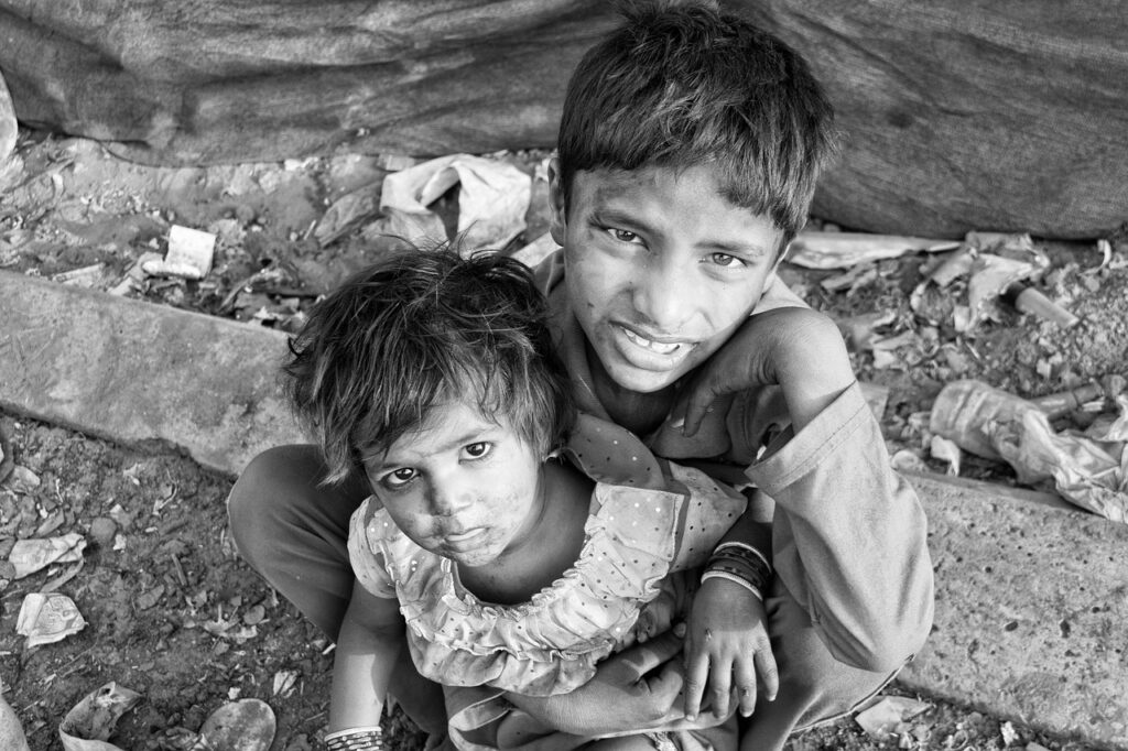
children, slums, poverty-2876359.jpg

Those In Poverty

The table provides statistics on age demographics, average income per person, and the percentage of people living in impoverished conditions.  Looking from an overall perspective, it is evident that Utah, despite having the highest percentage of minors, displayed the lowest figure for elderly individuals over 60, while Florida showed the most 60+ people. Additionally, California


Those In Poverty Read More »

poverty, black and white, emotion-4561704.jpg

Poverty Rates

The pie chart shows women in poverty in the United States and the bar chart compares poverty rates by gender. The pie chart demonstrates the poverty situation of females, whereas the bar chart compares poverty levels across genders. Overall, single women, especially those without dependent offspring, had the highest levels of poverty. In contrast, married

Poverty Rates Read More »

remote, work, office-5491798.jpg

Number of Jobs

The line graph delineates past changes in the employment patterns in three different industries in America and future predictions, in millions.  Overall, employment statistics in the agrarian sector decreased and will likely continue a downward trend, services have seen an increase and are expected to maintain a rise, and the rate of employment in the

Number of Jobs Read More »

coffee beans, coffee, roasted-1291656.jpg

Coffee Production

The given bar chart compares four different nations with regard to coffee production statistics. Looking from an overall perspective, it is evident that Brazil led all countries and increased both consistently and markedly at the end of the period. Indonesia and Vietnam also registered upward trajectories, but to a much lesser extent, while Colombia’s production

Coffee Production Read More »